Memuat
Products
Courses▾
Custom Development▾
Software▾
AI Workplace Safety DetectionFire/Smoke, PPE & Smoking DetectionPodRepurposeTurn 1 Podcast Episode Into 90+ Ready-to-Post Content PiecesWeb CerdasAll-in-One Marketplace Platform for Courses, Services & SoftwareOutreach EngineScrape Leads from Google Maps, Find Emails & Run Cold-Email CampaignsSawitKitaIntegrated Palm Oil Plantation ERP Software, from Estate to CPOMigasProUpstream Oil & Gas Production Optimization & Loss Control SystemCoalVisionAI Computer Vision System for Coal Mining Truck Detection & MonitoringMigasVisionAI Computer Vision System for Fuel Tanker Detection & MonitoringKarhutlaVisionAI-Powered Early Detection System for Forest & Land FiresVeriGuardProduct Counterfeit Detection System for FMCG, Cosmetics & Pharmaceuticals
Portfolio▾
Photoshop Action Portfolio · 200Photoshop actions with before & after images
Color Grading11Cinematic17Vintage & Film10Black & White10HDR & Detail10Pastel9Neon & Cyberpunk9Golden Hour10Moody & Matte10Weather10Night & City8Light & Glow8Sketch & Art9Duotone & Split Tone5Seasons4Dreamy & Fantasy5Retro & Graphic11Cartoon & Vector11Fog & Animation8Water & Nature5Glitch4Old Photo Effects4Painting4Film Look4Hand Drawing4
ANSYS FEA Structural Analysis Portfolio · 20Structural strength analysis (FEA) examples, with prices
ANSYS Structural Dynamics Portfolio · 20Vibration, impact and seismic analysis examples, with prices
Python Portfolio for Theses and Dissertations · 1,000Python analysis examples for theses and dissertations, with prices
Economics and Finance40Marketing and Consumer Behaviour40Human Resource Management40Accounting and Auditing40Public Health and Epidemiology40Medicine and Clinical Data40Nursing and Nutrition40Psychology40Education and Learning40Agriculture and Plantations40Fisheries and Marine Science40Forestry and Environment40Industrial Engineering and Production40Civil Engineering and Transportation40Electrical Engineering and Energy40Informatics and Information Systems40Geography and Disaster Studies40Meteorology and Climate40Sociology and Public Policy40Law and Criminology40Tourism and Hospitality40Sports and Kinesiology40Communication and Social Media40Chemistry and Materials40Logistics and Supply Chain40
MATLAB Portfolio for Theses and Dissertations · 1,000MATLAB simulation and analysis examples for theses and dissertations, with prices
Electrical Engineering40Mechanical Engineering and Vibration40Civil and Structural Engineering40Chemical and Process Engineering40Industrial Engineering and Production40Biomedical Engineering40Telecommunications40Power Systems and Renewable Energy40Robotics and Mechatronics40Automotive and Electric Vehicles40Aerospace and Aviation40Geophysics and Seismology40Geodesy and Remote Sensing40Applied Physics40Chemistry and Materials40Environmental Engineering40Naval Architecture and Ocean Engineering40Precision Agriculture40Instrumentation and Sensors40Quantitative Finance40Econometrics40Healthcare and Medical Imaging40Acoustics and Audio40Optics and Photonics40IoT and Embedded Systems40
R Studio Portfolio for Theses and Dissertations · 1,000R analysis examples for theses and dissertations, with project files and prices
Economics and Finance40Marketing and Consumer Behaviour40Human Resource Management40Accounting and Auditing40Public Health and Epidemiology40Medicine and Clinical Data40Nursing and Nutrition40Psychology40Education and Learning40Agriculture and Plantations40Fisheries and Marine Science40Forestry and Environment40Industrial Engineering and Production40Civil Engineering and Transportation40Electrical Engineering and Energy40Informatics and Information Systems40Geography and Disaster Studies40Meteorology and Climate40Sociology and Public Policy40Law and Criminology40Tourism and Hospitality40Sports and Kinesiology40Communication and Social Media40Chemistry and Materials40Logistics and Supply Chain40
Excel and Excel Macro Portfolio · 1,000Ready-to-use Excel files with formulas, dashboards and VBA macros, one price per project
Personal Finance and Monthly Budget Tracker25Small Business Cashier25Warehouse Stock Management25Employee Attendance and Payroll25Invoice and Billing Maker25Monthly Sales Report25Debt and Receivable Tracker25Class Schedule and Assignment Tracker25Student Grades and Report Card25Student Attendance25Instagram and TikTok Content Planner25Creator Sponsorship Tracker25Marketplace Dropship Order Tracker25Cafe Recipe and Cost of Goods25Meal Plan and Calorie Counter25Habit and Workout Tracker25Travel Planner and Trip Budget25Wedding Planner and Budget25Rotating Savings and Group Saving Tracker25Neighborhood Fund Ledger25Mortgage Installment Simulator and Tracker25Stock and Mutual Fund Tracker25Crypto Portfolio Tracker25Sales Lead CRM and Pipeline25HR Recruitment and Candidate Tracker25Project Management and Timeline25OKR and KPI Tracker25Vehicle Rental Tracker25Boarding House Management25Clinic and Pharmacy Stock and POS25Garage Service and Billing25Laundry Orders and Billing25Event Ticketing and Management25Library Lending Tracker25School Tuition and Fee Tracker25Online Ads and ROAS Tracker25Livestock and Farm Records25Survey and Research Data Analysis25Tax Records and Income Tax Calculator25Personal Shopper and Pre-order Tracker25
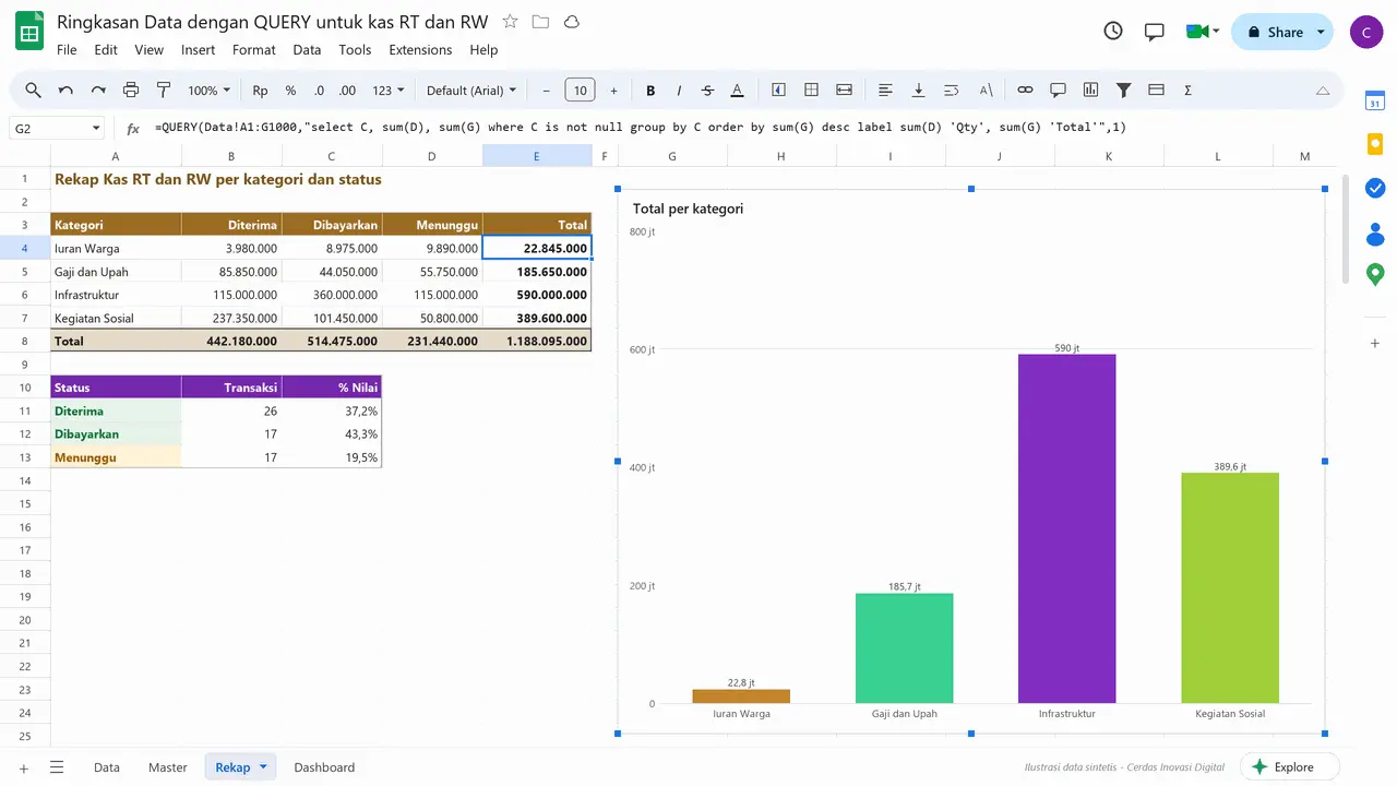
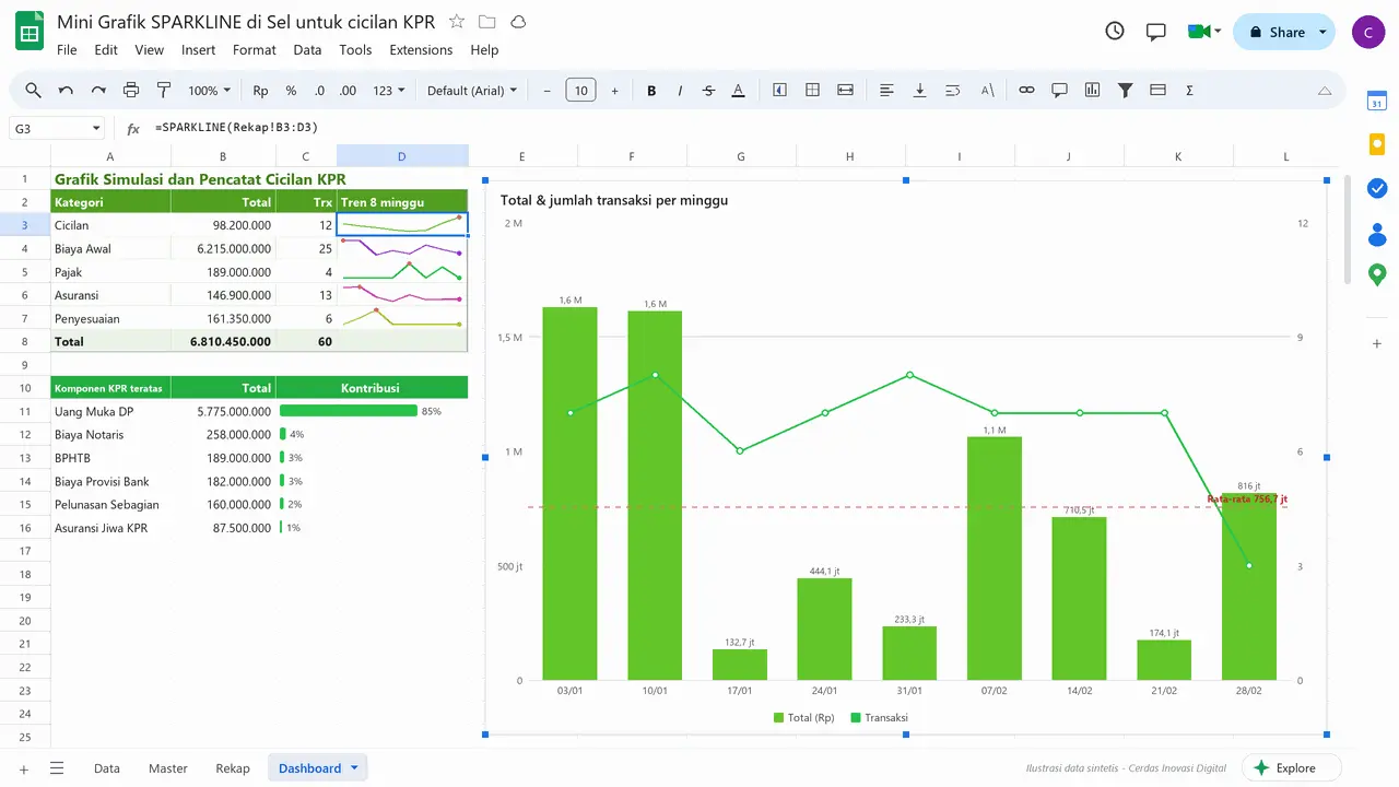
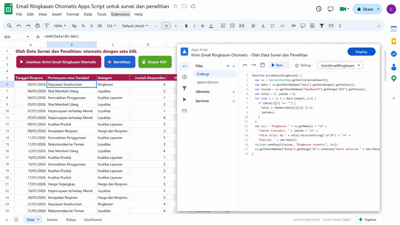
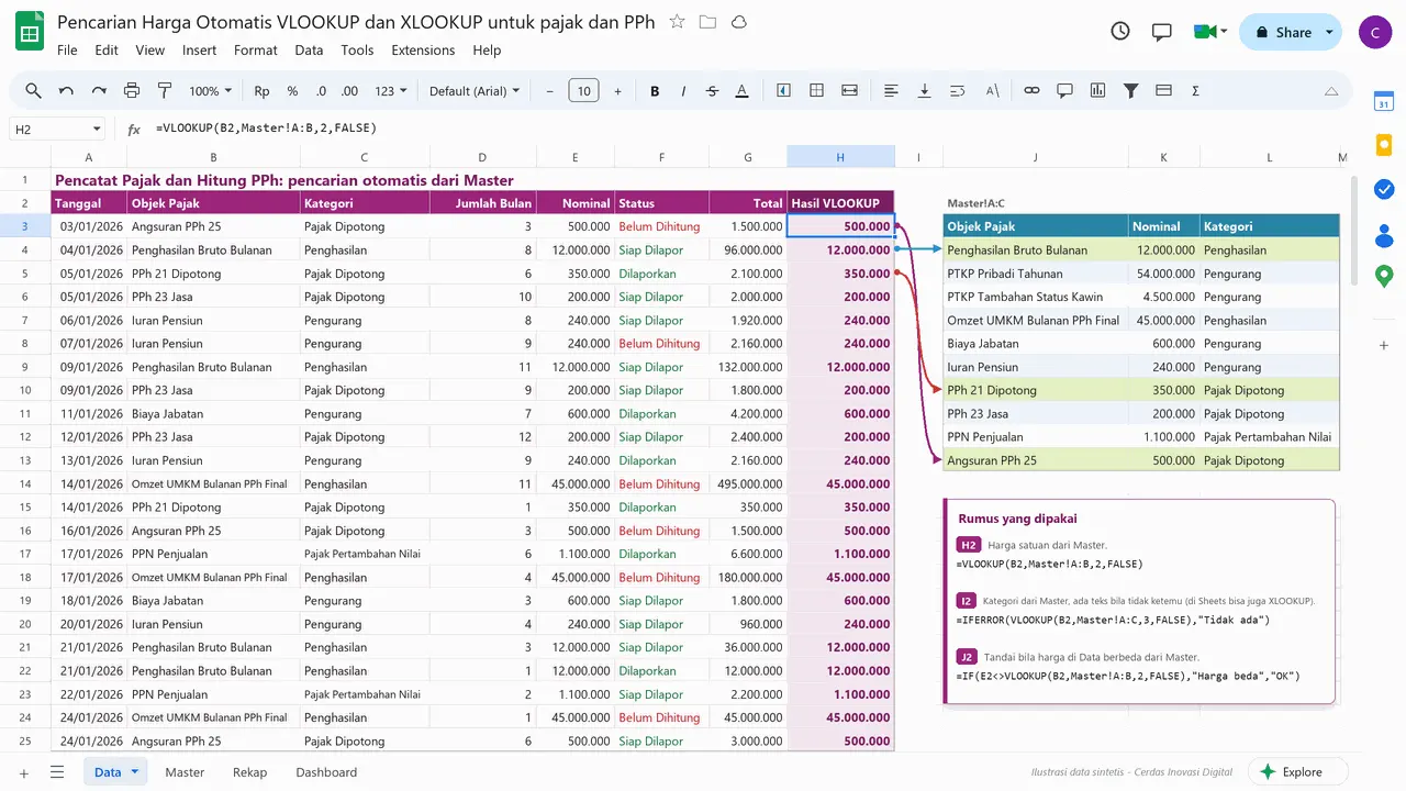
Google Sheets Portfolio · 1,000Ready-to-use spreadsheet files with formulas, dashboards and Apps Script, one price per project
Personal Finance and Monthly Budget Tracker25Small Business Cashier25Warehouse Stock Management25Employee Attendance and Payroll25Invoice and Billing Maker25Monthly Sales Report25Debt and Receivable Tracker25Class Schedule and Assignment Tracker25Student Grades and Report Card25Student Attendance25Instagram and TikTok Content Planner25Creator Sponsorship Tracker25Marketplace Dropship Order Tracker25Cafe Recipe and Cost of Goods25Meal Plan and Calorie Counter25Habit and Workout Tracker25Travel Planner and Trip Budget25Wedding Planner and Budget25Rotating Savings and Group Saving Tracker25Neighborhood Fund Ledger25Mortgage Installment Simulator and Tracker25Stock and Mutual Fund Tracker25Crypto Portfolio Tracker25Sales Lead CRM and Pipeline25HR Recruitment and Candidate Tracker25Project Management and Timeline25OKR and KPI Tracker25Vehicle Rental Tracker25Boarding House Management25Clinic and Pharmacy Stock and POS25Garage Service and Billing25Laundry Orders and Billing25Event Ticketing and Management25Library Lending Tracker25School Tuition and Fee Tracker25Online Ads and ROAS Tracker25Livestock and Farm Records25Survey and Research Data Analysis25Tax Records and Income Tax Calculator25Personal Shopper and Pre-order Tracker25
Classes▾
All Classes (118)
3D & Modeling
Blender (21)Architecture & CAD
Archicad 29 (BIM) (8)AutoCAD (10)Revit (25)Rhino 8 + Grasshopper (10)Twinmotion (10)Data & Analytics
Power BI Desktop (7)Engineering & Product Design
MatrixGold (3)Microsoft 365 & Azure
Excel (30)Mobile App Development
Flutter + VS Code (10)Pricing▾
Clients▾